The Frankenstein Reboot
From our portfolio: the redesign of BeyondPod for Android
“Nothing is so painful to the human mind as a great and sudden change.”
—Mary Shelley, Frankenstein
Prologue
What happens to the body of a man-made creature when you replace its head? Will the body live? How will it behave and what will it look like?
BeyondPod is a very popular podcasting application on Android. It’s been around for a long time, 2 million people use it worldwide. The small team running it is lead by Stefan “Dr Frankenstein” Kyntchev, who reached out to Opoloo almost two years ago, when we helped with some smaller UI optimizations and talked about the application and its ecosystem frequently.
Over the years, BeyondPod’s feature-set had been stitched together like limbs, eventually turning into a monster: it was becoming huge and ugly and had a hard time to reach new audiences. Eventually, we realized there would be no way around an extensive redesign — we had to cut off the monster’s head and replace it with a new one.
Research
Many of the millions of BeyondPod users love their podcasts, and so they use the app every single day. We wanted it to connect to new audiences while keeping the existing user-base happy. Replacing some colour and styles would not have had the impact we were looking for. But cutting out features, on the other hand, would certainly cost us plenty of loyal and outspoken fans.
Unfortunately, there weren’t many case studies to start with. The Android ecosystem is still very young, and extensive redesigns like the one we were approaching are usually not well-documented. What were we to consider if we wanted to attract new users and keep the existing ones happy? We had homework to do.
“How dangerous is the acquirement of knowledge and how much happier that man is who believes his native town to be the world, than he who aspires to be greater than his nature will allow.”
—Mary Shelley, Frankenstein
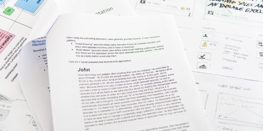
Let’s start with podcasts. The technology became extremely popular with the rise of Apple’s iTunes — a whole industry was created around it. Now, with emerging streaming technologies like Spotify, the mindset has changed. A common use case was the primary action behind an episode: Classic podcast users expect the episode to be downloaded first, with enough control over storage space and band width. A user influenced by Spotify, however, expects a file to be played right off the cloud, with some buffering at best. Both use cases need to be reflected in a podcast player’s logic and interface alike. To handle those dual perspectives, classic information design introduces Personas — diverse, fictional characters, that are used to determine different approaches and expectations.
Honestly, we’re not the biggest supporters of Personas in UX-studies, but in the case of BeyondPod they helped us keep the focus and determine edge cases. We ended up creating John, the technology-savvy guy who cared for full control, and Jane, who enjoyed listening to random podcasts while driving.
The diverging mindsets of those two lead to another fundamental problem: the decentralized distribution of podcasts. Basically everybody can create, host and distribute a podcast feed. But that also means they can remove episodes at any time. So let’s imagine: a user has downloaded and saved an episode on her device. That episode then gets deleted from the webserver, making it unavailable for everybody else. How does this reflect on common practices like bookmarks and favourites?
The questions are not new, but we have found various answers for the, and building a solid understanding of the core mechanics is vital for being able to bridge the gap between the iTunes- and the Spotify-Generation.
With that goal, we turned to the user stories. Over the years, the BeyondPod team gathered quite a bit of feedback, so Stefan was able to create most of the stories himself, adding plenty of edge cases and special requests.
Information Architecture
“If I cannot inspire love, I will cause fear!”
—Mary Shelley, Frankenstein
As one of the first podcast players in the Android space, BeyondPod had grown a very dedicated user-base over the years. These users strongly influenced the feature-set of the app, which eventually lead to a crowded and chaotic interface. New users had quite a hard time to navigate the plethora of possibilities, trying to make the most of the available options. Adding more and more organs to the creature over time made it a monster in complexity and appearance. Bringing clarity and accessibility back while keeping all the features became our paramount goal. We wanted the monster to be loved again.
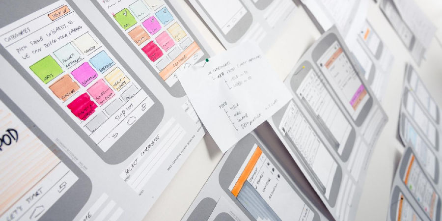
Based on our previous research and the user-stories, we divided the application into two main building blocks: a library for all the available content and the player with its rich capabilities. From there we started to dive into explorative sketching and wireframing on paper and whiteboards.
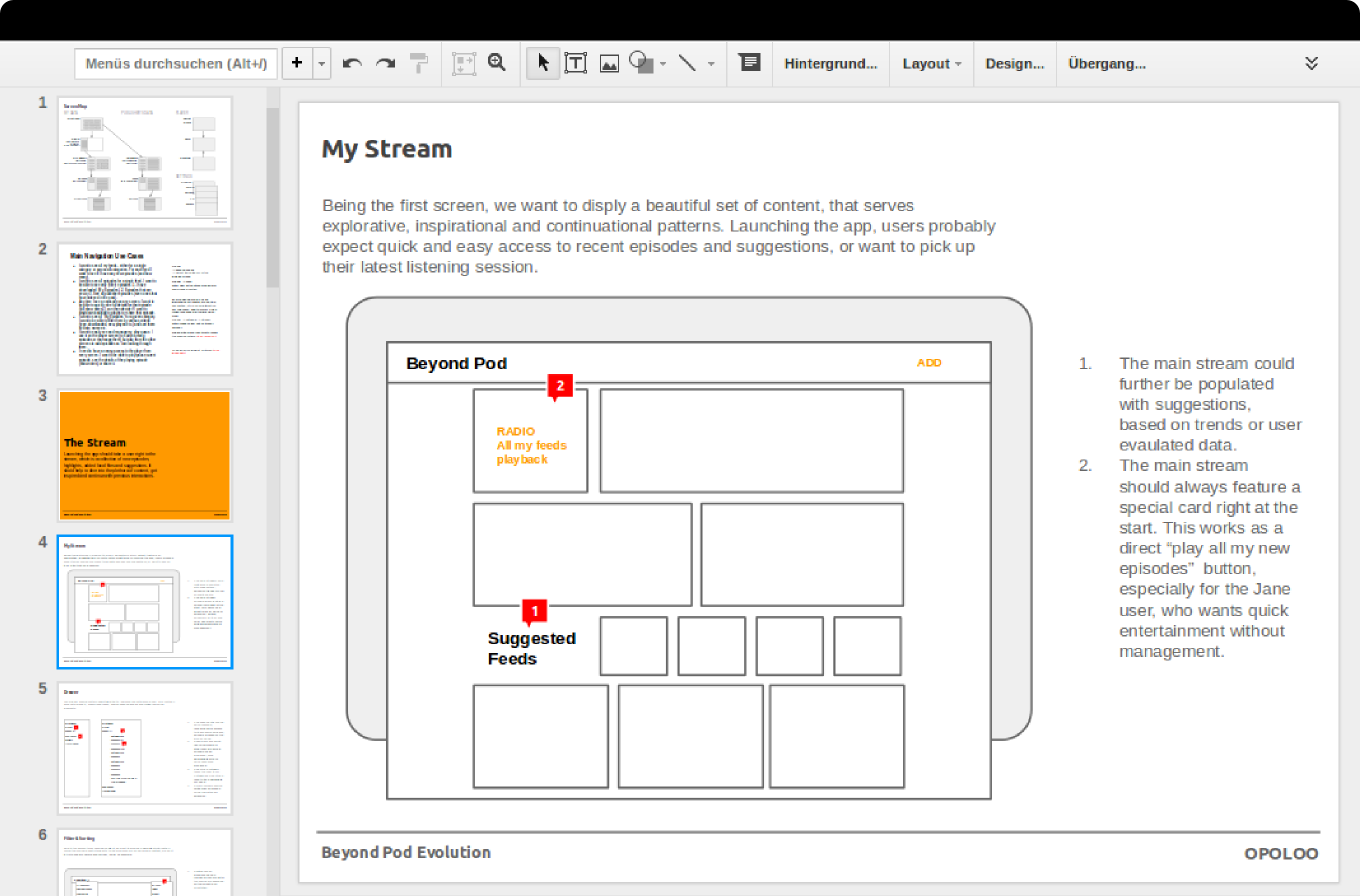
We could hardly build on the old architecture if we wanted new users to be comfortable with BeyondPod. Early on we realized that we simply lacked the fundamental understanding of the nuances and workflows BeyondPod’s audience was used to. We also didn’t want to start a long and expensive back-and-forth process, discussing every wireframe in multiple revisions. As a solution, we started to create the core set of wireframes as a Google Drive presentation with the BeyondPod team: everybody worked on the layouts, use-cases, and notes in a single document in real-time. This helped tremendously to keep discussions brief and we were able to map the whole complex application in just a few of days.
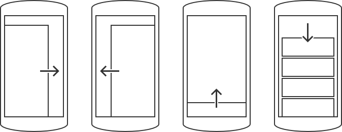
This way of communication and collaboration lead to two concepts that became the core of the new BeyondPod: four directional swipes and action-cards. Due to the various use-cases, we needed certain groups of information to be accessible at all times: swipe from the top to refresh, swipe from the left for the feed structure, swipe from the bottom for the extended player, and swipe from the right for the playlist.
Action-cards, on the other hand, are simply an extension of Google’s card metaphor. They are used to structure the information of each episode while controlling individual actions and the overall application simultaneously.
Interface Design
So far we had a blueprint of how the new face could work — now we needed to puzzle the monster together and define what it would look like.
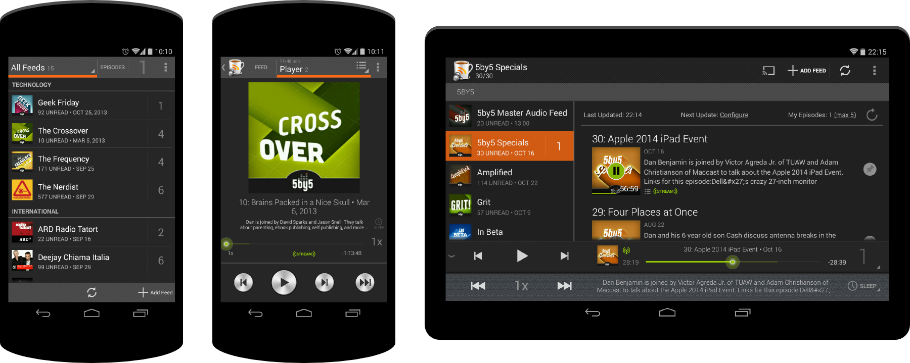
Comparing plenty of applications with rich media libraries and playback capabilities, we came to a simple conclusion: extensive information could better be displayed in a light environment, since subtle differentiation would help to scan the amount of data. Playing the content, however, works better in a dark theme, since it lets you focus on the pure information itself. For us, this meant light colours for the library and dark colours for the player.

From there a long phase of mockups started. We went from the player to the library, from the navigation to the playlist, always circling back to the information architecture, refining whenever possible.
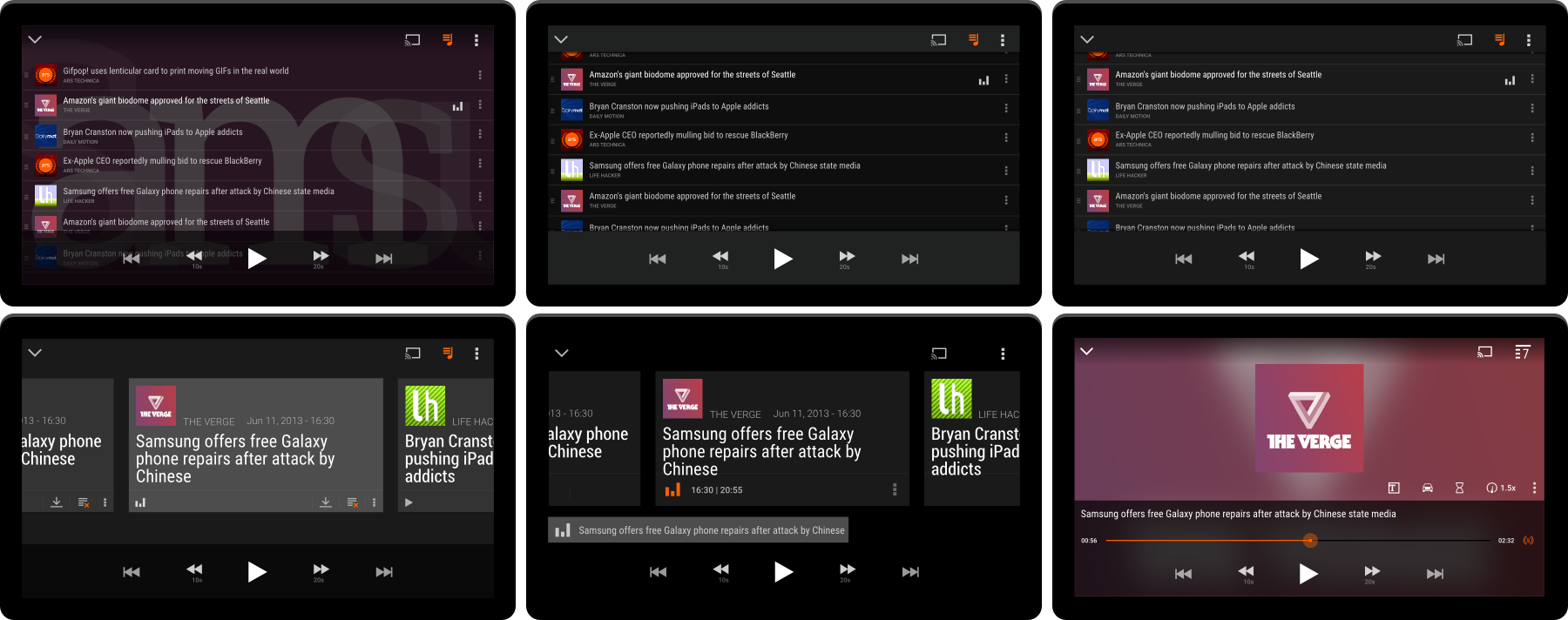

While doing so, new concepts emerged: the “charms” — little clusters of information that extended the players capabilities, like playback speed or a sleep timer.

Every time we were satisfied with a particular area of the app, we quickly cut up all the graphic assets and handed them to Stefan and his team. They then built a rough visual prototype, while we moved forward with the next chunk of work. Every so often we took a step back, testing the interaction and gathering some first feedback, which then made it back into designing the new BeyondPod. The whole process was highly iterative and helped to keep time and budget manageable.
Eventually, we had a prototype that worked quite well on the visual and interactive side, further confirmed by the beta community. After all, we needed to see how it would handle real data. Finally: time to sever the monster’s old head and replace it with the new one.
“There is something at work in my soul, which I do not understand.”
—Mary Shelley, Frankenstein
It ached and groaned and came to life for a brief moment. The physical body was working, but the thing was far away from being a beauty, still clunky and mechanic. We shut it down, and went back to work.
Branding & Polish
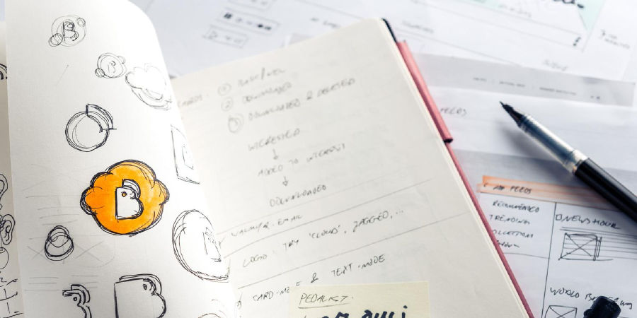
Contrary to other projects, we tried to keep the application’s branding, typography, colours and styles at a minimum, since we didn’t want personality and ego to get in the way of a clear information presentation.
With a working prototype in place, though, we needed to add character and quality to new BeyondPod, without getting in the way of the user experience and interaction principles. Up to this point, we had worked completely in black and white, so adding some vibrant colour seemed like a solid first step.
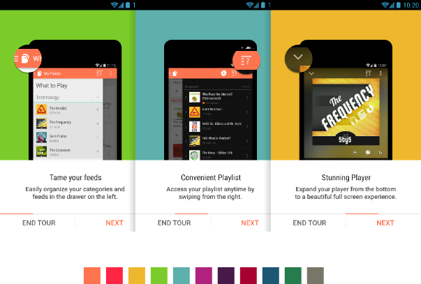
After some experimentation, we came up with a set of 11 unique colours. We sprinkled them into actionbars, special cards, categories and tour segments. Was this enough for a clean, yet characteristic experience? Almost. BeyondPod deserved a new logo.
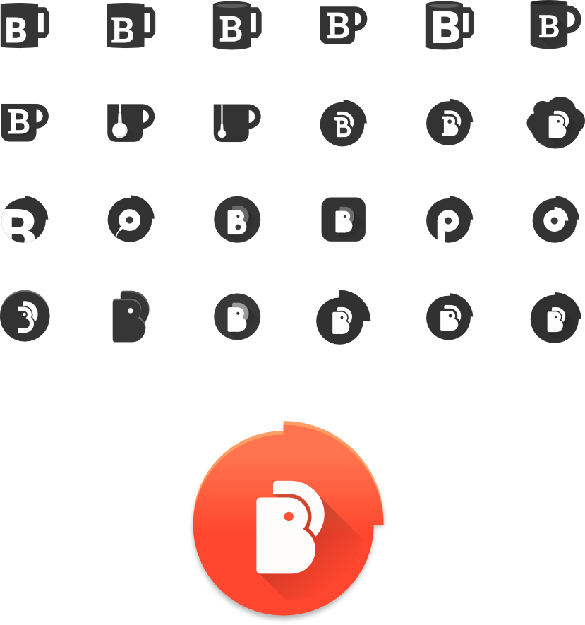
From there we went into an exhausting polishing phase. With the old monster’s powerful body, its new re-wired head and a colourful soul, we tried to make sure that as many stitches as possible were covered before reanimation. This took many weeks of reviews, improving assets, testing devices and fixing bugs — and honestly, we’re still not done.
Launch & Future
The creature lying on the barge was anything but a monster now. We hit the switch and saw electricity flow through its body. Sparks rained down as it slowly got up and started to move out of the laboratory. We certainly knew that not everybody would love what we created—the new BeyondPod seemed to have nothing in common with the old one. But we were proud of our work, knowing only too well that a time will come when we may have to remove its head again.
Like every application as popular as this, the redesign sparked very emotional reactions in the following weeks. A lot of bad reviews hit us on the Play Store: users were complaining about almost every detail, big or small.
“It took me two years to understand the app and now you changed everything.
Thanks. Uninstalled.”
—An unhappy user on the Play Store
This clearly showcased a major problem with the “buy once, update always” model. The old version kept growing, taking its fans along, but to new users the app was hardly accessible. Then again, the new interaction and design decisions attract a new user base that is willing to pay for the upgrade, while alienating some of the more seasoned users.
“I am seeing some strange behaviour after the update: everything just works! Also, I am not having trouble finding my stuff in the new UI. I don’t want to rush to a diagnosis but I suspect that is because the new UI is intuitive and looks awesome!
Really nice job, thanks a lot.”
—A happy user on the support forum
What makes development even harder is Google setting a crazy fast pace with the update cycles of Android OS and its fractured market. A small company like BeyondPod has a hard time to keep up. We were tempted more than once to try and keep everybody happy. But ultimately, this would have lead to our Frankenstein’s death, because he simply wouldn’t have been able to do that. We wanted to give the new Monster a real chance, even if that meant leaving something behind. As it turns out, BeyondPod’s monthly revenue more than doubled after the relaunch.
“...if I see but one smile on your lips when we meet, occasioned by this or any other exertion of mine, I shall need no other happiness.”
—Mary Shelley, Frankenstein
Our work on BeyondPod is not over yet. We’ll stick with the application, and keep improving it along with its website and Chromecast capabilities. Whether you’re new to podcasts or a seasoned advocate — download the app and give it a spin.

