Publication Paradigms for Longform Web Content
Transitioning from a blog to an online magazine
While some have predicted the end of the web as we know it — and with it high quality publishing —, last time I checked it was still here. Offline services like Pocket or Wallabag, combined with high-resolution displays and tablets, made longform reading of web articles very accessible. Platforms like Medium, The New York Times Magazine, Wait But Why, and a dozen others propel digital, sophisticated longform content to the masses.
Classic newspaper articles serve shorter pieces of information. Books are on the other end of the spectrum. Websites continue to fill all the spaces in-between. And why shouldn’t they? There’s infinite space in the digital landscape and diverse audiences can be found all around the world.
With a rising demand for quality, both for the content itself and its presentation, Opoloo has worked on plenty of publication systems lately. While this process continues, we want to share some learnings and insights apart from the general blog setup tutorials. If you’re serious about publishing content on the web, consider some of these web publishing paradigms.
Content
Work with an editor, always
Writing long articles means lining up plenty of thoughts and ideas, and putting them in a comprehensible order. Pieces of that information are obvious to you, but might be completely unknown to your audience. Leaving out such crucial data could quickly turn an enjoyable read into a Wikipedia scavenger hunt.

Working with a second pair of eyes and opinion helps to fill these logical gaps. Someone who’s not familiar with your topic or approaches it from another angle is often the perfect editor for your content. Not only can she point out leaps and gaps in your narrative, she’ll also improve accessibility through simplicity and clarity. Everything is better with an editor.
You need to factor in extra time between wrapping up an article and publishing it. Plan with this additional resource — your readers will be thankful for a more fluid experience.
Don’t compose for your platform alone
This is the internet, kids — your words won’t stay in one place for long.
While most writers create articles for their particular blog, magazine or outlet, that content will work its way through time, space and plenty of screens. Quickly, your perfectly arranged, big-screen-optimized texts will make their way through an RSS feed to an aggregator and end up saved in Pocket to be read on someone’s watch.

However your story is composed, make sure that it can stand the test of distribution and sharing. Don’t rely on complex systems to convey an idea, but make sure that text and images get the point across. Even if your platform supports unique features, animations or JavaScript niceness — your reader must be able to follow your river of thoughts without this fancy stuff, somewhere else besides your website.
Create for value, not money
We get it: most content on the internet is free and nobody will pay for it except scraggy advertisers. While this a far cry from what’s possible in 2015, many have thus built platforms around ad-banners where the story is broken apart and only seems to serve as a filler. There’s no real value in that — neither for the user nor the advertiser.
The same is true for company blogs that waste a visitor’s valuable time by explaining how great the company is. Understandably, they want to sell, but who wants to read self-adulation over and over?
Show, don’t tell.
Give examples, show your work, point out specific take-aways. We read because we want to learn. We read because we want to understand the finer details and the big picture. We read to make meaning. So that’s what we need to write for: an interested audience that gets a benefit out of your writing. This benefit might quickly turn into a business opportunity after all.
Presentation
Typography
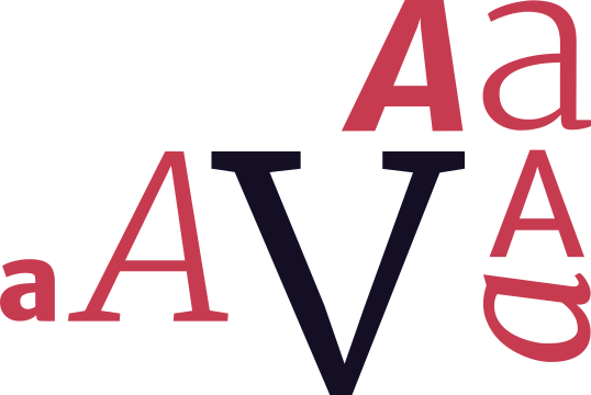
Highlighting the importance and value of typography seems tedious until you experience a poorly executed reading experience.

With plenty of free quality fonts out there, one can easily fall for fancy headline styles and unique letter details that make every peacock feel dull. But when styling copy for the purpose of reading, the fonts need to get out of the way. This does not mean that your font of choice can’t carry specific character that fits the brand — it means that clear and fluid reading comes first.
Picking the perfect blend of fonts is a science in its own right. Some of the things to look out for are
- a wide glyph set, including special and foreign characters
- at least two styles, preferably more, for emphasis and strong (don’t mix those up with italic and bold)
- solid hinting, so the font can be read nicely on small displays with low resolution
- high x-height performs better on readability
- source code must be set in a mono-sized font — period.
Against popular opinion, serif fonts don’t necessarily perform better at longform reading. Choosing between them rather depends on the character and style of your publication.
Proper typographic characters
Typography is an art, brought to perfection over centuries. If the old masters created curly quotes and em-dashes, they probably knew what they were doing. Using them shows you care about what you release into the world.
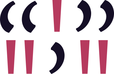
Most quality fonts support characters beyond what’s obvious from your keyboard for a reason. They improve the reading experience. Here’s an example:
Barthes writes: "Ultimately - or at the limit - in order to see a photograph well, it is best to look away or close your eyes. 'The necessary condition for an image is sight,' Janouch told Kafka; and Kafka smiled and replied: 'We "photograph" things in order to drive them out of our minds.'"
Compare this to:
Barthes writes: “Ultimately — or at the limit — in order to see a photograph well, it is best to look away or close your eyes. ‘The necessary condition for an image is sight,’ Janouch told Kafka; and Kafka smiled and replied: ‘We “photograph” things in order to drive them out of our minds.’”
Be honest — the latter is not only aesthetically more pleasing, but by simply using the proper characters for quotes and dashes, the whole construct becomes much simpler to scan and process. While this attention to detail is often dismissed as a type-fetish, it makes all the difference between a nagging blog and a quality magazine. That’s how typography do.
Responsive-optimized reading
Creating long copy is one thing — showing it to your audience is another. In a world where everybody uses a different device to read, this can become a science of its own. Instead of diving too deeply into this field, we want to offer a simple checklist — rules of thumb that will improve every reading experience:

Font-Size
Here, bigger is better. If the fonts are too small, you have a hard time reading at all. If they are too big, you only read more slowly. A solid body-text size should be between 16–20 pixels, depending on the font-family.
Reading distance
A large monitor sits roughly 40cm away from your eyes; a smartphone is much closer to your coffee-widened, googly peepers. Make sure to reflect those distances in your font-size and media-queries. Ultimately, there’s no way around real-live testing.
Line-height
Probably being the most underrated metric, line-height makes all the difference. 140–170% feels like a good benchmark for body text. Headlines, though, work better with 120–140% line-height, since they are perceived as dividing blocks of information.
Contrast
Placing black text on a white background or vice versa tends to be hard on the eyes. Instead try to go with more subtle shades of gray, without losing the needed contrast — always to be tested with a small screen in direct sunlight.
Semantics & markdown
Steadily, markdown is becoming the standard in the world of digital writing. It’s fast to pick up, flexible in use and scales very well for an abstraction language.

But make no mistake: as simple as it is to put words on a screen, as hard it is to get a perfect presentation of the final content. Depending on the markdown version used, writers have plenty of options to format individual copy. If there’s a semantic element that can be used, be certain that somebody will.
Too easily we forget to properly style the less frequently used headlines or we skip the second level of an ordered list. And how about image captions and attribution of authors to quotes that aren’t even covered by most markdown specifications?
Almost all semantic elements are there for a reason. When we create longform content, each element serves its purpose and will get used, eventually. The lesson here is to make sure that all of them get their deserved attention when styling the presentation, and to make sure that they all work in harmony.
Here’s a short list of often missed possibilities that will ruin a beautiful reading experience if not taken care of:
- all headlines from H1 to H6
- lists and ordered lists with second and third level hierarchies
- tables (in GFM)
- all elements can be linked, including headlines, images, and quotes
- very big and very small images
- source-code
- emphasis and strong combined
Publishing
Publication rhythm
Some cheap, ad-overloaded, SEO-optimized stories aside, things get written to be read. You don’t want to spend those long evening hours on a piece just to see it paddle and drown in the stream of time, because everybody missed it.

Considering that every publication has its own audience, we need to keep in mind that they have their own expectations and rhythms. Understanding and tailoring to them is relevant for every magazine’s success.
Time
If you want people to read your output, you need to work towards their schedule. A magazine for children publishes in the afternoon since kids go to school in the morning and might spend their weekends outside with friends. A tech article may get better traction in the afternoon hours (depending from where you publish), but not immediately before the weekend.
Quantity
Reading needs dedicated time. The longer an article gets, the more time is needed for it to be consumed. Never release more content in succession than your audience can work through — if visiting your platform feels like stress, you’re doing something wrong.
Frequency
Offering valuable content regularly is great, but it comes with expectations. If the publisher sets out to release two quality stories each week, she needs to make sure that this schedule can be kept over a period of time.
Spread the news, but keep a copy
Spreading content and finding audiences has never been easier. Social networks are great multipliers for your content, and so are platforms like Medium or email newsletters. After all the internet is a network that was meant to spread ideas and connect them to people.

With that said, we encourage every publisher of content to keep a certain level of control over her writing. Social services and technologies change rapidly, and most act in their own interests first. If your handcrafted stories don’t favor their agenda anymore, you will be dropped or shut out.
Sure, setting up your own publishing platform takes time and work, but it will be worthwhile if you’re in it for the long run. Your content will be stored in your personal archive, safe and sound while you spread it across the web.
The writer’s ego
Understanding and building publication systems took us years, and we’re still learning. Writing this article had me sit down for approximately six hours with another one hour for proper editing — the graphics added another two.

With all that time and energy spend, one will quickly understand that publishing any kind of story is directly linked to the authors’ egos.
A good story carries an author’s personality, character and soul — the currencies of publishing. We pay back with admiration, respect and proper attribution.
Whatever kind of information gets published, especially when more than two creators are involved, needs to make room for the author’s name, links, image and description. Still, quality stories are written by humans, and this must be reflected by the underlying platform — it should always be about the content and its creators alike.