Redesigning the Topgear App
Marie Schweiz's Android Design Workflow
Anyone who isn't familiar with Topgear (at least in the English speaking part of the world) may deserve a smack on the back of his/her head for ignoring popular culture.
Just in case, here's the short version: Topgear is a terribly popular television show broadcasted by the BBC. It's about cars – fast and awesome cars of any kind. And about the three guys hosting it who are as funny and witty as it gets.
I redesigned their Android app, because, well… it was awful. This is a showcase of what I did and how I pulled it off.
1. The Original Material
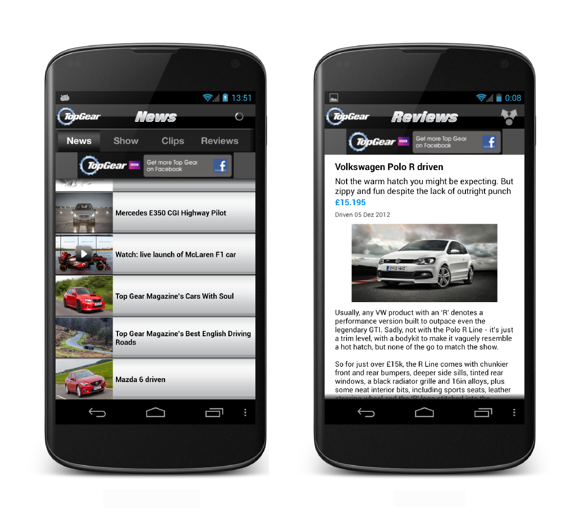
You can see clearly that this was ported straight from the iOS and just doesn't work for Android.
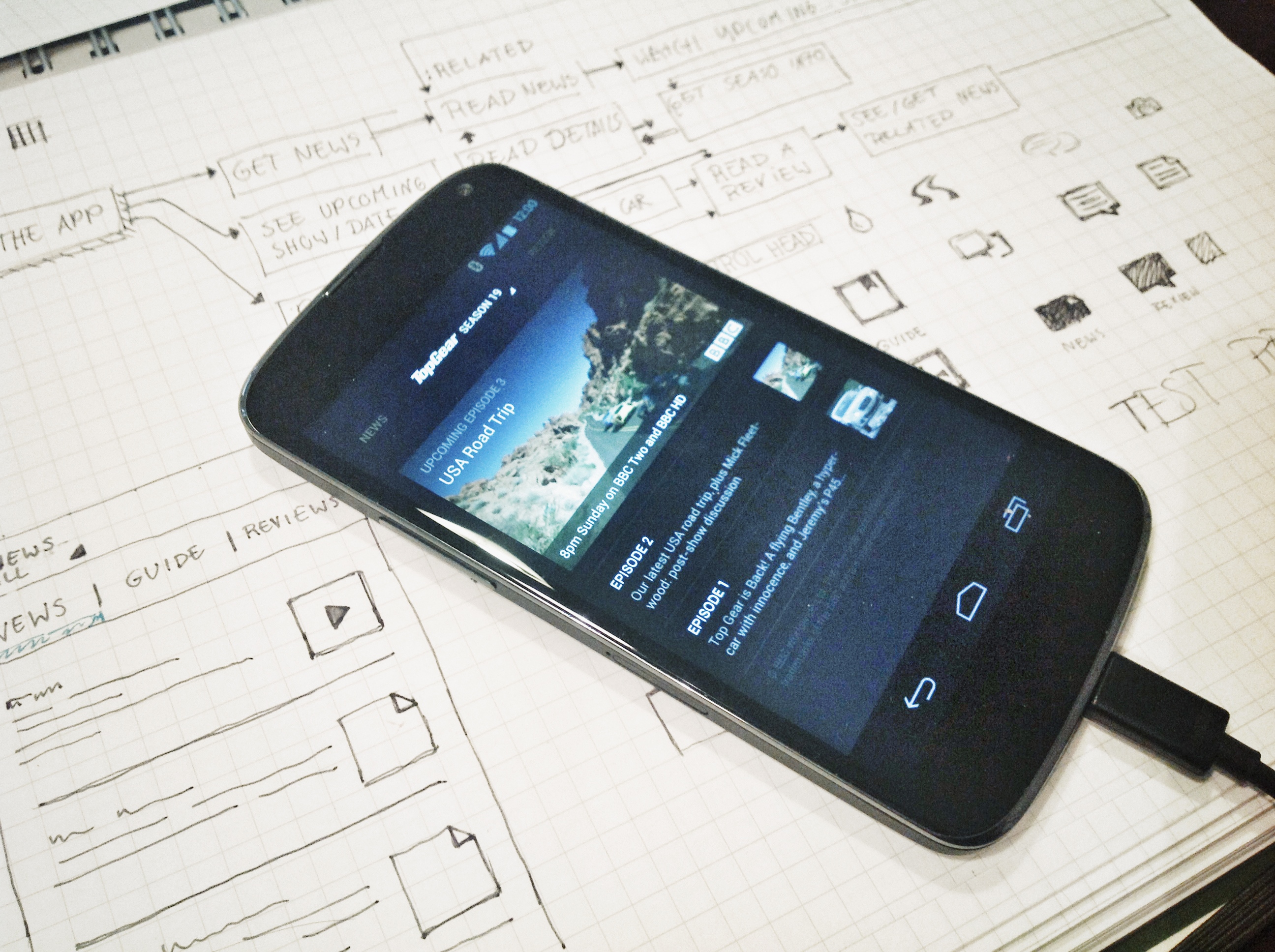
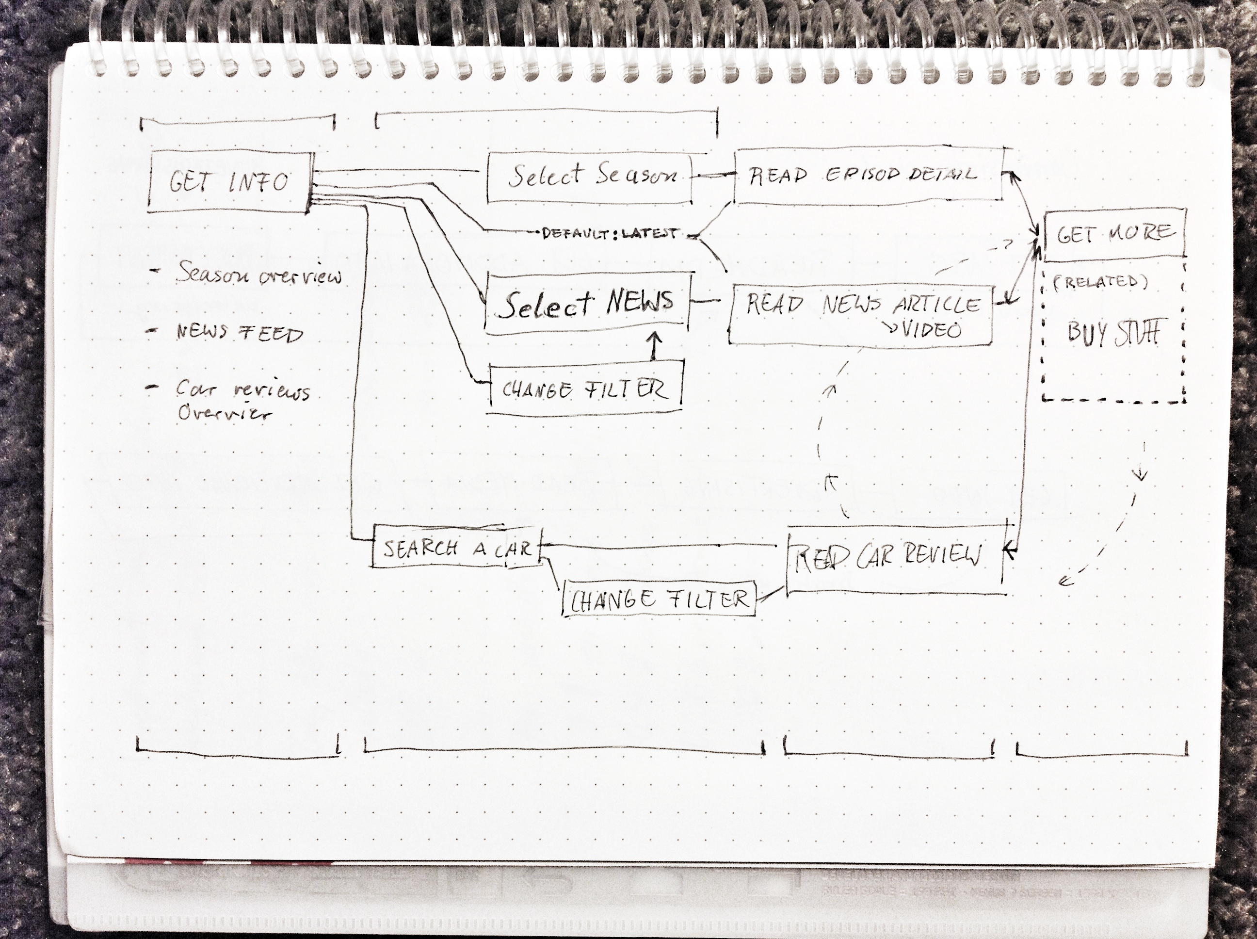
2. The Concept
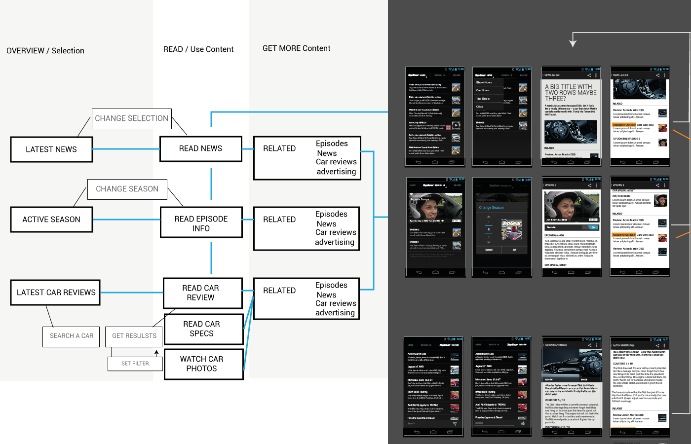
In scribbled wireframes I have laid out what is to become a solid, nicely working Android app. You get the notion: it is pretty complex at first, but that's exactly what a good UI design should do: break apart complex structures and make them accessible for the user. Here you get some insight on the information architecture and the thoughts I put into it, featuring the overall purpose of the app, the structure of the presentation, and the proposals for individual screens.
![]()
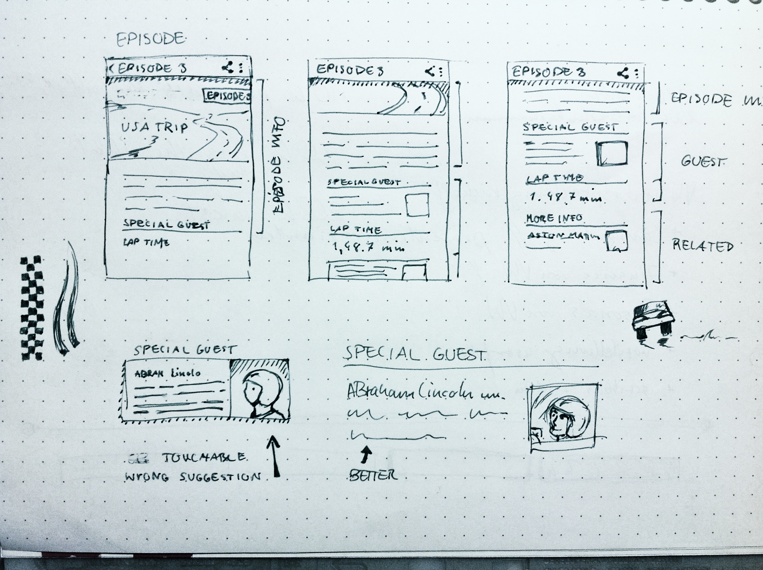
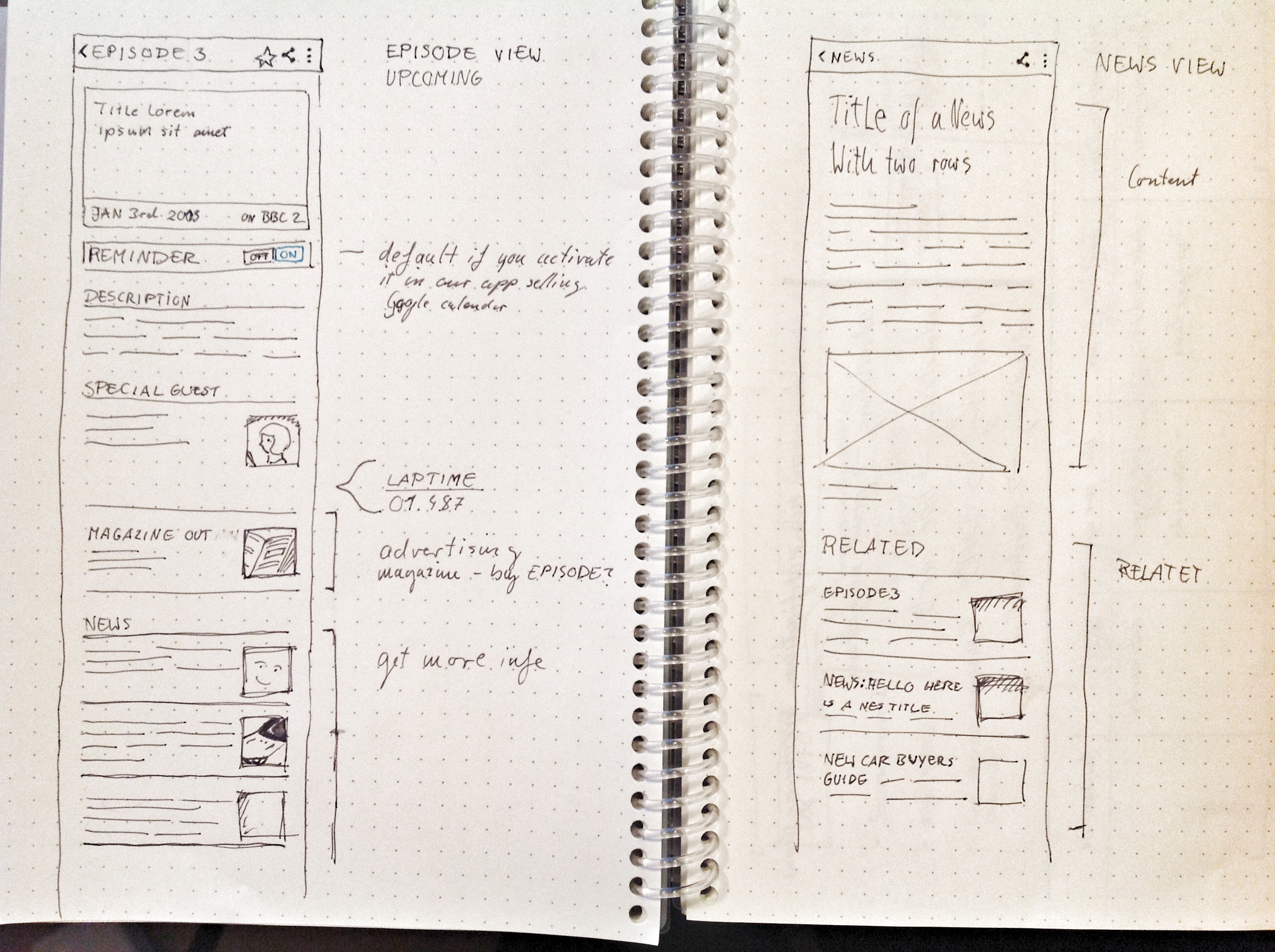
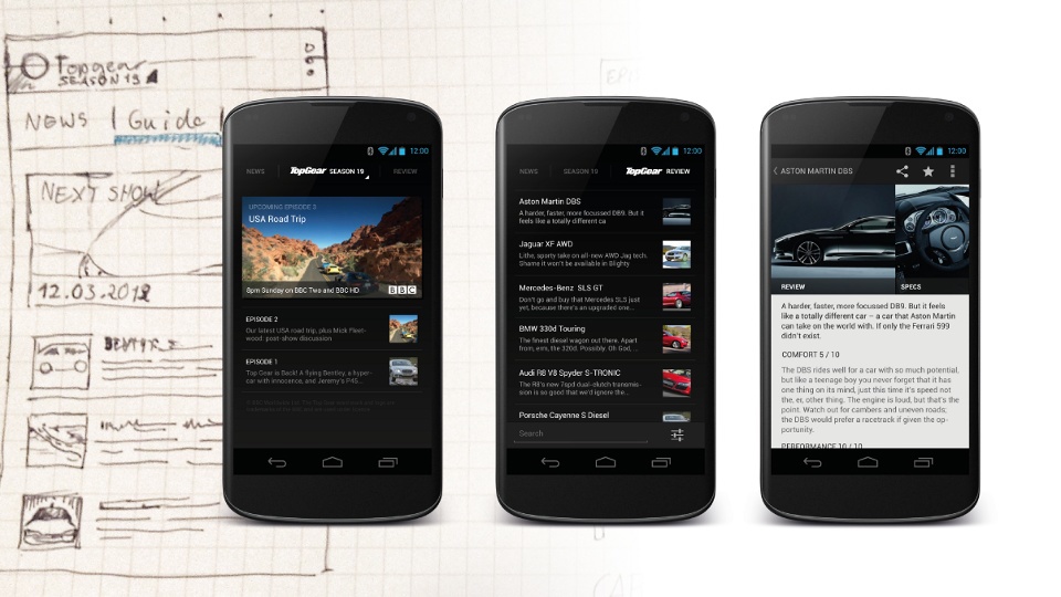
3. The Redesign Process
From the scribbled layouts of the app screens, the content structure and the navigation, I dove into Illustrator to really take everything apart and build it anew.
So now, to the individual screens of the app: I stuck very closely to the Android guidelines, as you will see. No gradients or skeuomorphisms – everything's flat now. You really start focusing on the content instead of the UI, which is even more important for such a feature rich, complex app as this one. One more aspect that shouldn't be forgotten is staying true to the branding as much as possible.
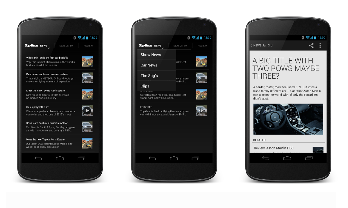
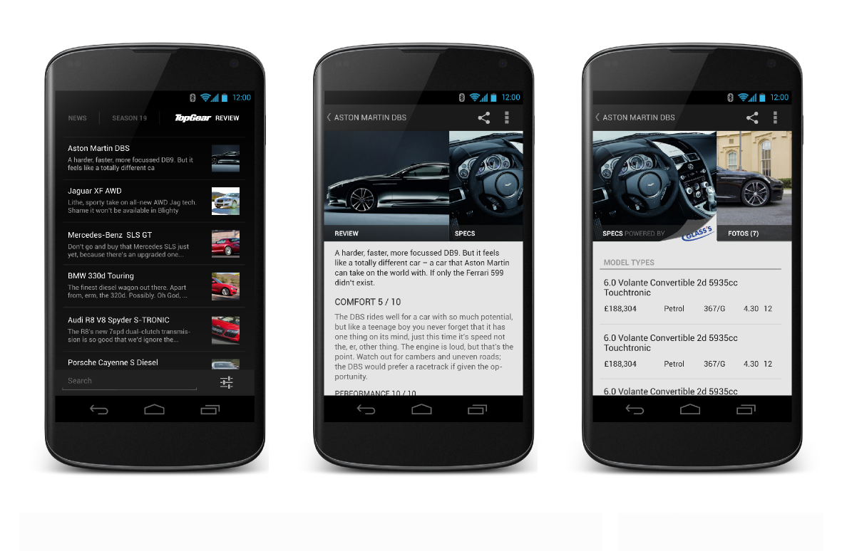
The News Screen
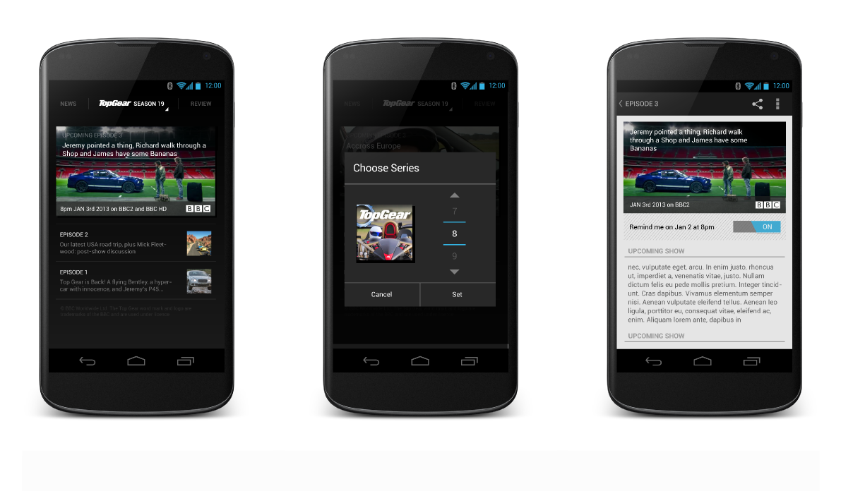
The Seasons Screen
The Car Reviews Screen
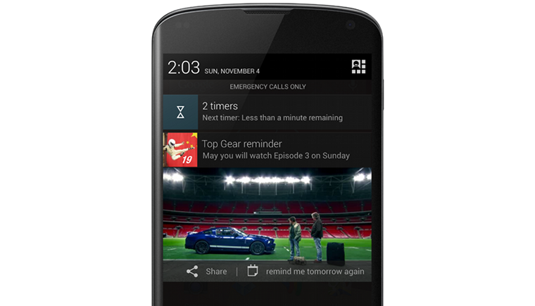
Oh yeah, and don't forget about the rich notifications:
4. The Results
Initially, I laid out a hierarchy of the app. With this in mind I designed the screens to make them match:
Now think way, way back: remember the original material? The result has little in common with it anymore. Man, that was easy. I wonder what took me so long.