Improving by Design
Gmail's design continues to show Google gets it
Make It New — The Drawer Pattern
We find some official new patterns in the Android Design Guidelines and one of those is in the new Gmail app: the drawer pattern. I've never been a fan of it.
In most cases of its implementation, this pattern was simple used without further consideration instead of trying to solve the real UX problem that presumably made the pattern necessary.
My opinion doesn't apply to the Gmail app. The drawer gives you a high level navigation to the various ways to view a list of messages. Before the drawer concept, a dropdown was used in this scenario to provide ways to filter or change the messages visible in the list. Having the drawer slide out over the content and provide a very clean list of accounts, inbox and labels becomes significantly uncluttered compared to the previous implementation that was using the ActionBar dropdown.
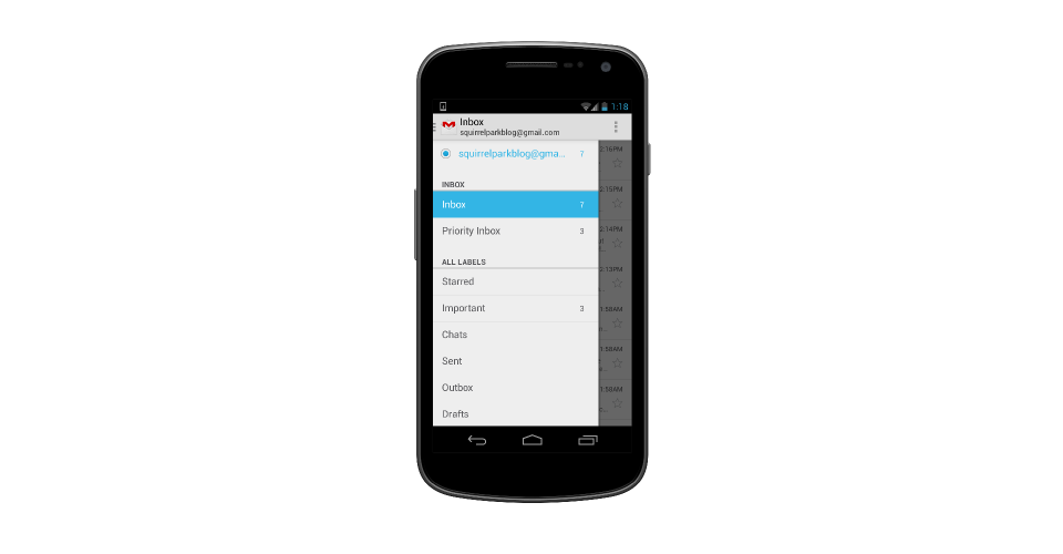
This is not to say that anyone using an ActionBar dropdown should halt all development and quickly switch to the drawer pattern. Gmail's list is variable and could get fairly complicated. This is not something that works very well in a dropdown. The pattern employed really depends on the application and what you are trying to solve. This is why we have many different options. Not every element makes sense for every problem.
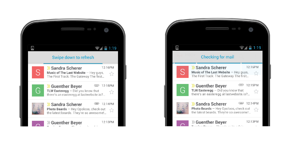
Refresh
Gmail's new pull to refresh functionality is hands down one of the coolest interactions I've ever seen on Android. I am thoroughly impressed with how well it works. If your application has a concept of refreshing, I think this is absolutely the implementation to use. I love how the list doesn't actually move, all the feedback sits in the action bar and you see a horizontal progress indicator that neatly fits right at the top of the list. I've never been a fan of the lists jumping around and taking up space to show a circular progress indicator: a waste of space to show something so trivial. I'm very excited to see more applications taking Gmail's approach to refresh list content.
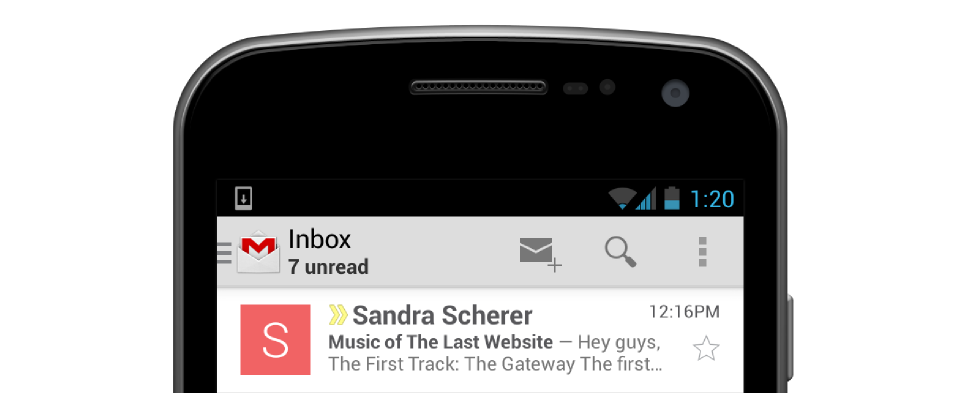
Unread
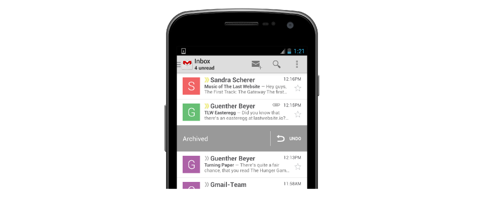
A subtle detail when you launch Gmail is the unread emails count underneath the 'Inbox' title. After a few moments this switches to show you the account you are looking at. This is perfect for me as I don't really need to constantly see the unread count. When I open the list I can glimpse to see it and focus on reading the actual messages in the list.
Undo
One pattern Gmail has used for a few versions now is the undo concept. Instead of bothering the user with a popup to confirm, it performs the action and then lets the user undo it if the action was unintended. I love the interface for this. I noticed when trying to refresh offline that the same popup UI is used for retry.
There's one place they still aren't using this and it is definitely annoying: when you want to discard a draft, you still get a confirmation dialog. It would be great to see this move to the undo experience that Gmail is using throughout the rest of the app.
Remove
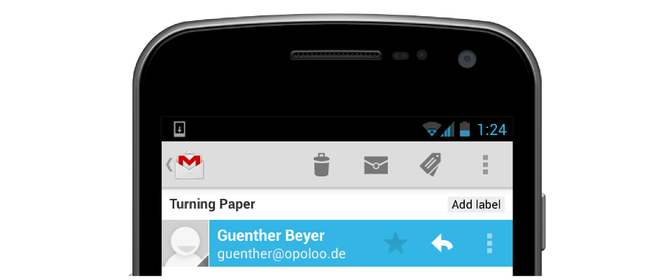
Removing the split ActionBar was also a great decision. I found myself not using all those items frequently. The three options shown now when a message is open ("archive", "mark unread", "move") are really the ones I use the most. Even "delete" was great for the overflow. Adding avatars to the message list also gives a nice touch, breaking up the large amounts of text that was in the list in prior versions.
Polish
Overall, I'm very impressed with the new version of Gmail, and application developers definitely can learn plenty of items from it. I'm looking forward to more Google apps that follow with improved designs as well as third party developers. We are at a point now where polish and good design should be an absolute must for all applications.