Fast Icondesign
It's not Rocket Science
Icondesign still seems like the highest form of art within the field of interface design. While this is definitely true for large Play- and Appstore logos, visual cues and navigation icons have become much simpler to create and style with the rise of mobile design.
In this article, I quickly want to give you a rundown on how to create a nice set of icons very fast, and the pitfalls to look out for – I'm assuming you can handle your graphics tool, be it Photoshop, Illustrator, Inkscape or anything else that makes working with simple shapes easy.
Sketch
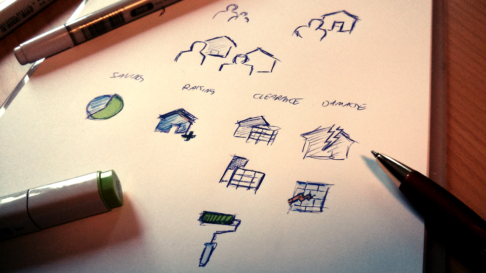
Let's always start with some sketches. You want to make sure, that your client deals with the metaphor and only the metaphor, instead of focusing on all the colors and details in the first place. Maybe this is a good point to offer some alternatives, if you're not 100% sure about a certain item.
Shape

After all the sketches are signed off on, jump straight to the basic shapes with your preferred editor. Depending on the size of the icons, I would suggest caring for pixel-perfection already, since this will be much harder to get right later on in the process, especially if you're recycling single elements throughout the set. Try to stay within the grid for all horizontal and vertical shapes and strokes. Still, stay away from the color.
Color

Now let's throw in some color. Most iconsets are related to a certain branding, so you might want to take a good look at the styleguides or try to stay as close to the brand as possible. Remember: Most icons are used together with others, so try to not have every icon scream for the same attention. Use color wisely to balance out importance and differentiation across the set and the UI. Also, this might be a good time to test your icons against different background colors and shades of grey.
Weight

This might be the step most young designers skip in the beginning. Your icons will probably never show up on their own. This is even more important if you're working on the same set with other artists, or tying into an existing set. While all icons are based on the same square frame most of the time, you have to carefully balance the weight of the icons across the set. Plane shapes with a filled body need to be much smaller within the artboard, while complex shapes with fine elements should use as much space as possible.
Light, Shadow & Effects

At this point, all icons should work nicely without any additional effects. If that is the case, why not add a little for extra appeal? How about just giving the bottom pixels a slightly darker tone for each color and highlighting the top ones equally? Try out some gradients, drop shadows or bevels if it matches nicely with the brand. Just don't overdo it. Icons are meant to emphasize certain elements of the UI, not distract from them.
Hopefully, this short tutorial made icondesign a little less frightening. While you should leave the core icons of a set or product to the professionals, creating a quick favorite-star or bookmark-ribbon might make the difference in your app's UI, without the need to hire an expensive designer.