Extract/Infuse Magic
On Magic and Mundaness of Logo Design
We have heard the stories of big brands spending millions and millions on their logo designs, signets and colors. Then again, there are the stories of very popular companies, well known and with global recognition, that have never spent a dime on their logos. There seems to be some kind of magic involved in logo design: Why does one logo work well and another, similar one does not? What makes it appeal to us? Why are some logos worth a ton of money? Are the others worthless? What kind of logo is adequate for me and my company? Can my clients relate to it? How can I create that perfect logo that’s been haunting me in my mind?
All those questions don't have a definite answer and they cannot all be addressed here. But what matters is this: a logo needs to work for the company or client and their audience on many levels, including the cognitive and emotional one. Recently I had the opportunity and pleasure to help out my friends, The Brothers Chapman, with a new logodesign. After some years of loose collaboration, the three brothers decided to combine their beautiful storytelling skills under a unified brand. Unfortunately we were right in the middle of the production of The Last Website, so time was scarce. Luckily, by that time, I knew the three well enough to grasp the notion of who they are and what made them move — a good logo is always the visual, economic or cultural representation of an individual or group. It therefore, somehow, needs to align with their values.
Frankly speaking, the brothers appear like a bunch of chaotic nerds, their heads in the clouds and their distinctive humor the color of a black hole. But they are not. Each is a master of multiple skills, well educated, polite, with a deep sense of communication and a hunger for individual expression. Everything they do is open and clear, yet with a dark edge of character that many storytellers and writers are lacking these days (by now you can tell that I'm a fan). The logo obviously needed to reflect this as a conflation of clarity, sophistication, and a drop of chaos.
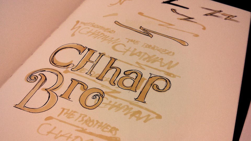
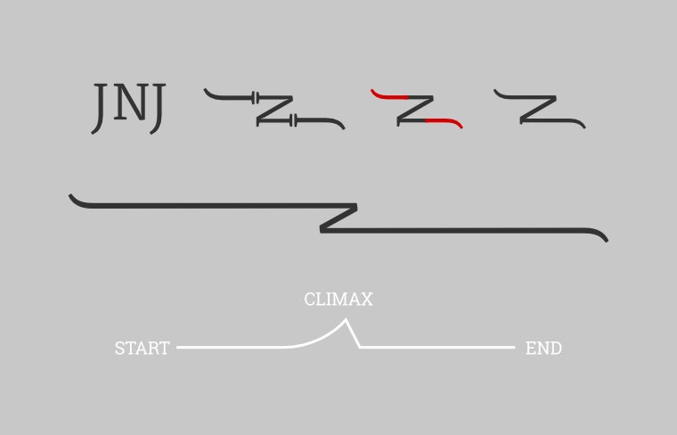
Since the brothers are storytellers, their logo needed to tell a story as well. With that in mind, I started sketching random ideas, trying to find a solid hook I could hang my ideas on and have the logo evolve from there. It certainly helps when you have some fitting fonts as a reference for what might and might not work. I recognized an interesting pattern by sticking their initial letters together (Jared, Nathan & Joseph): JNJ. By twisting and bending those letter shapes, I got to the point where they started to resemble a storyline with a strange cuspid contortion at the center: a perfect match.
That storyline signet felt like a solid start. Time to add in some letters. I had picked some random fonts earlier, so I simply went with Fjord (which you can get here), because it felt classic and contemporary at the same time. As a side note: arranging the typography around a signet and thus forming a decent logo takes time and some practice. Eventually you get to a point where everything starts falling together.
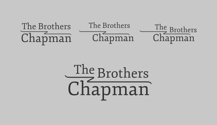
Although this was a clean and solid logo already, something was still missing: the drop of chaos that made The Brothers Chapman so unique. Looking at the rough outline of the whole composition, the logo seemed to move into many different directions at the same time. By switching out some lower case letters with capitals, the whole appearance became streamlined while introducing a certain, chaotic rhythm that you might not recognize at first sight.
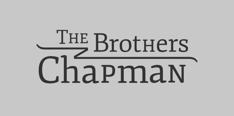
At that point I was pleased with the process and sent it off to the brothers for review — not just the final logo, but the whole step by step process displayed here. The feedback came rather fast: "Such a beautiful story behind a beautiful logo. We could see this hanging on a wooden sign outside a workshop."
What I would love you to take home from this logo design process is that there is no magic involved. Rather a little experience, a solid understanding of the values of the client, and a fitting story that supports a connection with the visuals on an emotional level.