Draw a Line — Dashes and the Subtleties of Elegant Writing
A guide for the oblivious and the unaware
The dash is a neglected species of punctuation marks — funnily so, not because it’s just an obsolete sign without purpose, and not because it’s not used. It can be spotted everywhere, in all kinds of writing. People use it, the dash fulfills a need. Rather, it’s neglected because only few people seem to care about using it correctly. By correctly, I mean: according to function.
Why Bother?
A small line that simply varies in length? Why waste thoughts on sign that is typographically as challenging as the dot or the slash, that is about as sexy as the mole rat, and that makes your life — which is probably already filled with enough stuff you have to keep up with — even harder?
It’s about purpose
The dash is a simple line that can be applied very effectively. There is meaning in a dash. The dash introduces versatility to writing and takes it to another level — the level of consciousness, of elegance. It allows for variation in style, it changes the tone and voice of your writing. It’s a tool that can be very powerful if it’s applied for the right job. Yes, you can drive that nail into the wall with the back of a wrench, but you could also just use a hammer.
Along the same lines, you wouldn’t replace a period with a comma, a colon with an interpunct, a slash with a stroke or backslash.
Admittedly, I’m using the dash in an inflationary manner in this post — if only to make a point. But it’s much more about what in German is termed “fingerspitzengefühl”, the subtle touch that can make something go a long way.
No matter who you are, whether hitting a keyboard is what you make a living on or not: if you care about your writing, you should make sure to use the dash correctly.
Types of Dashes
Let’s make sure we get the terminology straight, so we know what we’re talking about.
(Yes, each of the following is usually represented in any well-designed font.)
(Yes, it matters on the web, too.)
Each font applies slightly different measurements and styles. The one above is Garamond.
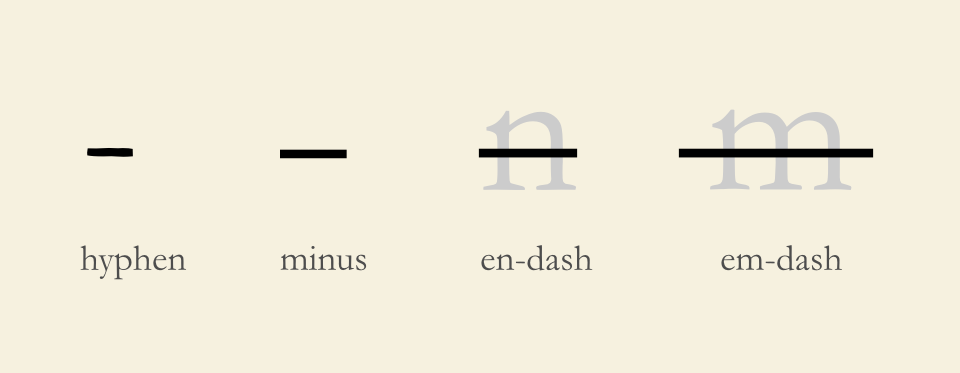
Hyphen
The hyphen is often referred to as a dash, although that’s not entirely correct. The hyphen is used to connect words or prefixes and to sepa-rate words in justified text. That’s about it. So use it if you want to say “three-year-old banana”, “orang-utan”, “love-letter”, “soul-wrenching”, “arm-wrestler”, or in names (such as Mary-Anne Clumsberg-Finkelstein).
The HTML entity for the hyphen is
‒
Minus
Longer than the hyphen. Use it in mathematical equations. Not for anything else. Never.
The HTML entity for the minus sign is
−
En-Dash
Longer than the minus, about the size of an “n” in most fonts. Use it to indicate closed ranges of values, such as a time frame, temperature ranges, and from … to relationships or connections of any kind; especially if one part is to receive more weight than the other.
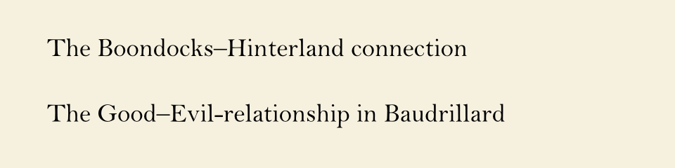
This dash lets you aim for accuracy and disambiguation. The classic example is from Strunk & White: The Chattanooga News and the Free Press merged, resulting in the Chattanooga News-Free Press. If you’re smiling, my congratulations: you have understood the use of the en-dash.
The en-dash is also the only appropriate sign for a bullet mark.
You may use the en-dash to introduce a segment — a thought — into your sentence by including a space before and after the en-dash. This is common practice in German or French, and the internet’s lingua franca — a watered-down version of English — seems to have generally adopted it. The die-hard dash-police officer would certainly disagree with this use in English. She wouldn’t be entirely incorrect: you may also use the em-dash, which might be more apt for your purpose.
The HTML entity for the en-dash is
–
Em-Dash
Usually about twice the size of the n-dash, approximately the width of an “m” in most fonts.
Some writers use a double hyphen (- -) to indicate the purpose of an m-dash. That’s a relic from typewriter times. Are you writing on a typewriter? Do you want to pretend you’re writing on a typewriter? In that case, please go all the way and imitate that terribly obnoxious hammering noise, including the CA-CHING!!! sound at the end of each line. If not, don’t use double hyphens. Welcome to the 21st century. (Sometimes, however, you will not get around using double hyphens to indicate an em-dash, especially in some text editors and social media platforms. Most of them let you type an en-dash, though, which you should then space to create a similar semantic effect as the em-dash.)
The em-dash is one of the most beautiful punctuation marks. Not because of its visual concept, but because of the semantics it introduces. I’d like to refer you to some masters.
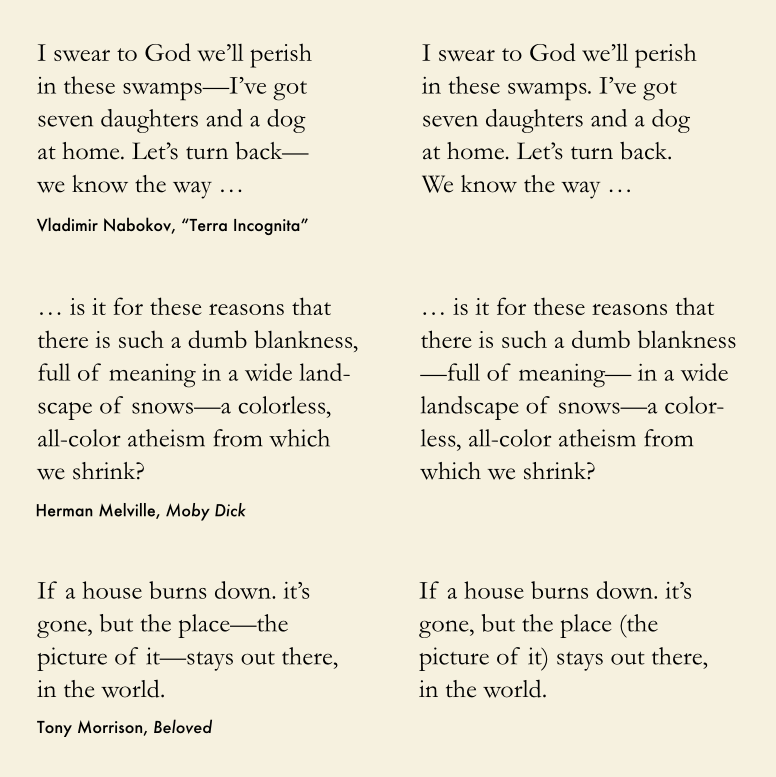
Apt use of the em-dash induces dynamics, rhythm, sprightliness, or reluctance and prudence. Its purposeful application implies a humbleness before the sign, before the craft of writing, and also indicates that you know about and care for what you are doing.
The em-dash can be used to insert a thought, or break of thought, a specification of a concept. In contrast to parentheses (also commonly used to set apart sections of sentences) the dash has the effect of highlighting the interpolation (which is meant to be read, rather than giving us cause to skip it as unimportant). If you feel that ending a sentence with a period and then introducing that thought with a new sentence would disconnect the thoughts, whereas a connection with comma would not separate them enough, use an em-dash.
The em-dash is also a versatile tool in creative (or let’s say “fictional”) writing, for example as an ellipsis or interrup—
You may also find it useful if you want to disjoint sentence parts, as in “So how’s the wife and — dammit Justin, how many times have I told you not to lick the dead rabbits! — anyway, what I meant to say …”
It’s fine to also space the em-dash (unless it’s particularly long and looks iffy with spaces).
The HTML entity for the em-dash is
—
No matter what you do: be consistent
Back-pedaling a bit, it needs to be stated that uses of the dashes, even the “official” or “authoritative” ones, tend to vary. But — as with most aspects of writing — consistence is key. Never, though, is it acceptable to just replace a dash with a hyphen or a minus, unless you aim to build a reputation as a bad stylist. Rather, experiment with them until you get a good feel for the dynamics. Awareness and a little practice will improve your writing skills.
You could be the em-dash of contemporary writers.