Android Developer Icons 2.5
XXHDPI for the Rescue
More than three years ago we created the first Androidicons set out of curiosity: 20 free icons for an undefined, extremely new, mobile operating system. No further intentions.
Since then, Android has grown beyond anybody’s wildest imaginations, and so has our small icon set. Thanks to those little pixel graphics, we’ve worked with amazing developers and companies from all continents, traveled to all kinds of meet-ups, and spoke at events with global impact.
It’s pretty hard to say “Thank You” for all this, but let us try anyway: We just updated the set to version 2.5, including xxhdpi resources, 50 new icons and lots and lots of polish and refinements. This update is free to anybody who supported the set previously. You should receive an email with your new download link in the next couple of days.
XXHDPI
So let us try to give you a better idea what’s new. First and probably most important to you cutting edge devs is the addition of xxhdpi assets. Yep: big, glorious, colorful icons for HTC One, Nexus 7 2013 and all the other pixel density escalating devices.
New Icons
![]()
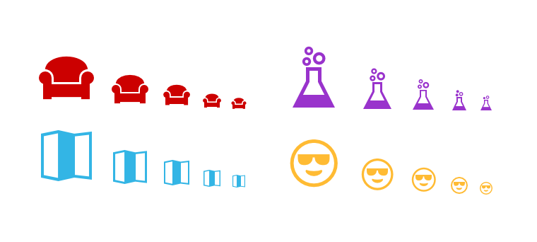
We compiled the previous updates into one big set and added many new ones, raising the icon-count to 250. With 5 sizes and 14 colors, the whole set is now contains whopping 17,500 individual graphics. There are new icons for transportation, typography, social media, and many more — including the classic floppy save icon, which has been requested way too often for my taste.
Weather
![]()
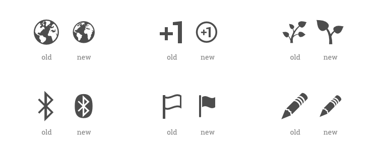
Android’s visual style has slowly but steadily been improved by Google. The very harsh lines have become much smoother over time, while keeping the clarity and simplicity. We tried to reflect this in the update as well. The new weather icons are a good example of how Android’s 4.x style has evolved.
Polish, polish, polish
We touched up every icon, some more than others. They became crisper, got restyled, scaled and balanced to be more in line with the whole set. Although this was an enormous endeavor for all the 250 icons, we still feel there’s room for improvements. Feel free to let us know if you stumble across an icon that feels a little off, too small, too big or generally out of place.
Arrow Consistency
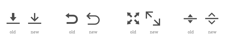
Despite vigorous pixel-pushing, the previous set still contained a few inconsistencies. This was especially visible in the different arrow heads used on various icon combinations. Some were wider, some were less pointy, some were shaped differently. This is obviously not the best statement to make in a visual language, so we took the opportunity to correct as many as possible.
So, there you go: Thanks a lot for sticking with us and supporting Android and our icon set. If you purchased it in the past, you’ll receive a new download link soon. If you don’t own it yet, there are 250 little reasons to get it now. Including a glorious mustache.