An Android App With Five Corners
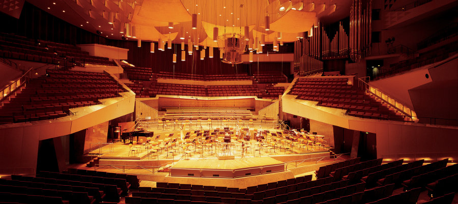
From our portfolio: Application design for the Berliner Philharmoniker
“If classical music is to have any future, it must embrace all the media it can and find new paths to its listeners, no matter where they are and how they wish to indulge in their passion.”
—Alexander McWilliam, Director of Online Development at Berlin Phil Media GmbH
In December 2013, we teamed up with Novoda once again, this time to create a user experience for the Berliner Philharmoniker.
Being one of the most renowned symphony orchestras worldwide, they realized the need for distributing their concerts across digital channels. Frequent live broadcasts, a concert archive, movies, plenty of interviews with conductors and soloists, and more can be found in their digital repertoire: a selection that many a fan of classical music would be eager to get their hands on.
All this content is housed in a streaming service called the Digital Concert Hall, accessible through web browsers, smart TVs, iOS and Windows apps. The last missing piece was a proper Android client and Opoloo was more than happy to step into the breach.
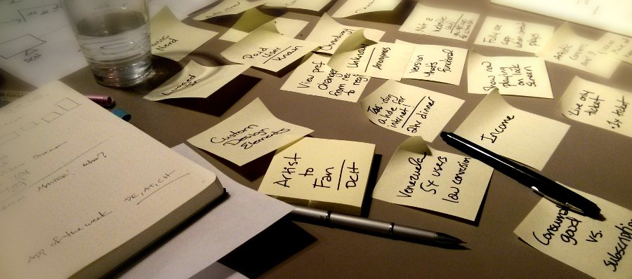
1. The Workshop
To understand the company, the brand, and the audience, we met in Berlin for a two-day workshop. The setup was a beautiful mix of project owners and managers of the Berliner Philharmoniker, nxtbgthng (in charge of the iOS development), and Novoda covering the Android side.
Our job was to make sure that the apps deliver their content according to the expectations of the audience—in short, to create a solid User-Experience.
During the workshop, we learned about the Digital Concert Hall’s history, their global audience, business goals and how our work would tie into their future strategies. Every idea and question that emerged was scribbled down on a post-it or typed into a text editor, then put up on the wall. Categorizing and sorting those notes helped us evolve a strong vision for the app’s information architecture and feature set.
After those two days we headed back home, feeling great about the project. It was motivating to work with a company as respected and value-driven as the Berliner Philharmoniker. But it didn’t take long before reality caught up with us.
2. The Scope
As it turned out, the budget of the Berliner Philharmoniker was tight. After all, this was their first foray into the world of Android. Would the platform reach their target audience? Could it handle their high-quality content on a large scale? Understandably, they were skeptical about the app’s success.
With just two developers and one designer on the project, we certainly were limited in scope and features, contrary to other divisions of digital design. Then again, Novoda and Opoloo are a well-established team. Challenge accepted.
With the limitations in mind, we fleshed out a new strategic information architecture for the Android audience: give them exactly what they want, skip everything optional.
We wanted the app to be the 101 of Android development, complemented by a solid user experience, stable API communication, and smooth responsive design to cover plenty of devices. No Chromecast support, no widgets, no unnecessary extras.
3. Sketching & Prototyping
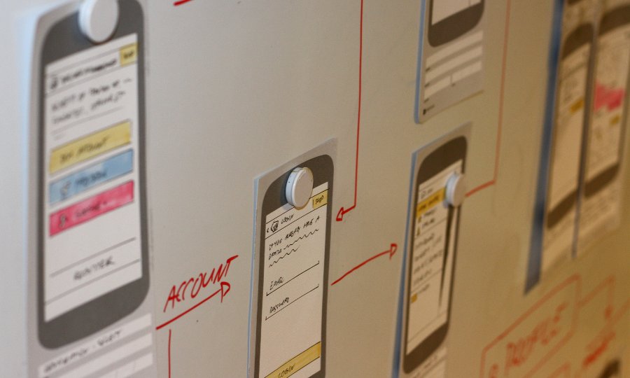
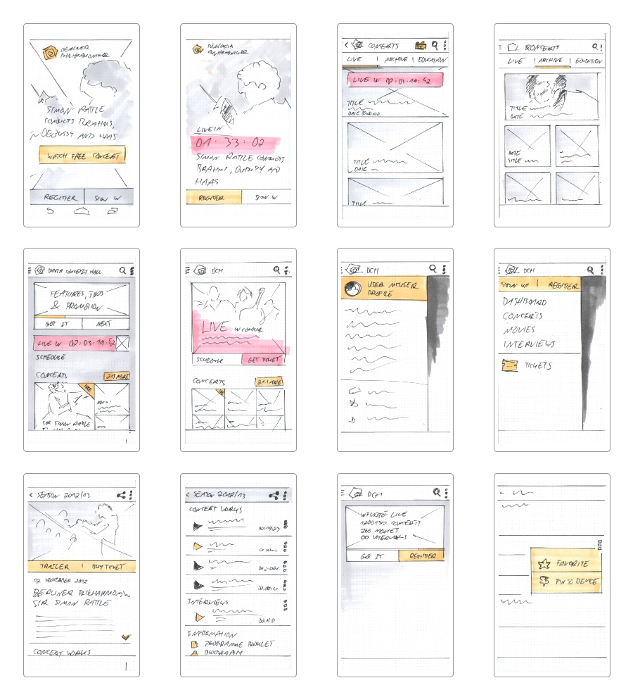
To set the right expectations for the whole team as early as possible, our first goal was a fast prototype: we wanted to cover all the content that would make it into the first release. While one developer tapped into the Digital Concert Hall’s API, the rest of the team sketched simple wireframes and welded them together with a running Android prototype. This helped us get a good feel for the content and the layout of the application within just two days. From there, we were able to experiment with alternatives, to add and remove features without slowing down.
4. Branding the UI
The Berliner Philharmoniker present themselves in a beautiful brand experience. Everything—from their movie covers and record sleeves to their concert house—is coherently designed with exceptional quality and aesthetics. Unfortunately, of course, their style guides were never created with Android in mind.
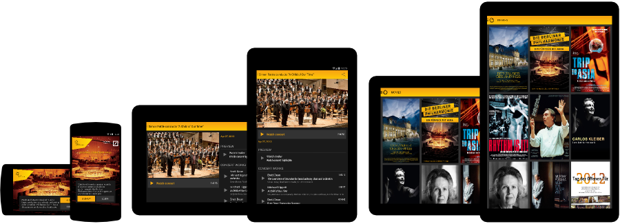
Mobile and responsive designs demand a certain simplicity and flexibility to be able to work and scale across sizes and devices. Detailed patterns, high resolution images and delicate typography are certainly not what the plethora of smartphones and tablets can handle equally well.
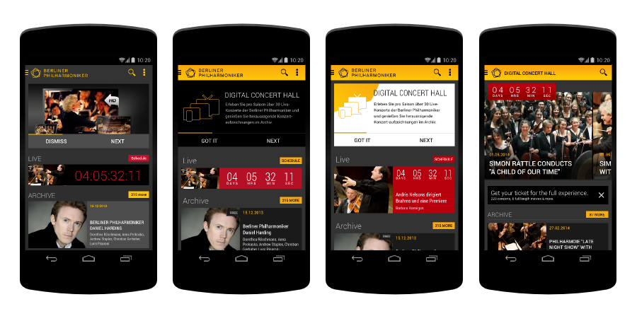
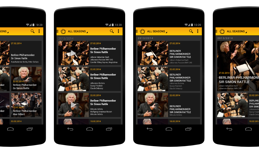
We went though plenty of design iterations before we found the right balance between native Android components and the unique brand. Relying on a simple, dark card-layout, with some spots of yellow and red felt just right. The heavy lifting was done by the flexibility of Android’s Roboto font and the quality pictures of the Digital Concert Hall.
5. Responsiveness & Polish
We can’t stress enough how important responsive design has become when trying to deliver a solid Android experience. The first batch of mockups started with a 4-inch device in mind. Alongside, we explored with simple sketches how those mockups would scale across screens and orientations. This helped the developers to adapt styles from the mockups while incorporating break points and layout changes from the wireframes. As we moved towards the final phase of the project, more detailed mockups and occasional reviews helped improve the quality further. Ultimately, we went back to Berlin for a final day of optimization and tweaking, all looking at one screen.
6. Testing & Launch
The development was accompanied by a small but dedicated beta-tester group, managed via Google+. Those people helped tremendously with finding bugs, testing plenty of devices, and offering feedback on accessibility and usability. The launch on Google Play went buttery smooth and as of my writing this, the app stands at a strong 4.7 rating with more than 5,000 downloads.
Wrap-up
One thing echoed throughout all the planning and development stages of this beautiful project:
Small teams can create great experiences if the expectations are set according to the demands of the project and if they are agreed upon by all parties.
We never tried to design the most innovative application, crazy interaction patterns, or cover every piece of content available. Instead, we aimed for an application that would give Digital Concert Hall users exactly what they’re looking for: access to the best classical content wherever they are—all wrapped in a smooth user-experience.
This is how every Android project should be approached and executed, and we are not alone with this opinion:
“Opoloo understands the Android platform design guidelines at its ultimate perfection and takes them to the next level. Not only with fresh and responsive concepts but also with a balance between UI/UX and development effort like no one else out there.”
—David Gonzalez, Senior Software Craftsman Novoda Berlin“In all seriousness, this project has been the smoothest I have ever experienced.”
—Alexander McWilliam, Director of Online Development at Berlin Phil Media GmbH