The Shopping Revolution
From our portfolio: UI & Interaction design for Tesco’s Hudl
“Günther, can you come to London tomorrow, we really need your help on a super secret project.”
Novoda’s Kevin McDonagh called us, late in February, 2013.
The super secret project was what months later was revealed as the Hudl—Tesco’s first foray into the world of 7-inch Android tablets. The idea: build an inexpensive device with good hardware and sell it in Tesco’s stores, providing a clean Android experience with Tesco’s services through a unique launcher and Google Play.
Opoloo’s part in this collaboration was to support Novoda in making sure that user experience and visual design of the Tesco Groceries app was on par with the high expectations of the Android ecosystem.
The Branding Challenge
After a good initial round of sketches and wireframes, we hit our first rock. Bridging the gap between Tesco’s world-renowned branding and the Android platform was a huge challenge. Initially, the bold red-and-blue/black-and-white combinations seemed like a good fit for the operating system’s aesthetics. However, Tesco itself was in a process of refining its visual branding guidelines as we moved forward. We had to question every single UI element over again, sometimes with long feedback loops, to see if we were still in line.
Should we go with a blue actionbar or sidebar? Does a white background work across all sections, or rather light grey? Do we adapt button styles from the web or from the Windows 8 client?
As we worked through plenty of mockups and experiments, we moved closer and closer to Android’s native style. The strong brand colors we used as subtle points of attention, while shades of grey provided differentiation to the UI. Android's native font Roboto replaced Tesco’s custom typefaces. Cards and full-bleed patterns structured the extensive amount of information, bringing the content up front.
The application started to feel right as soon as the branding took a backseat to the operating system’s style and guidelines, which is exactly what users expect from an application they use daily.
The Dashboard
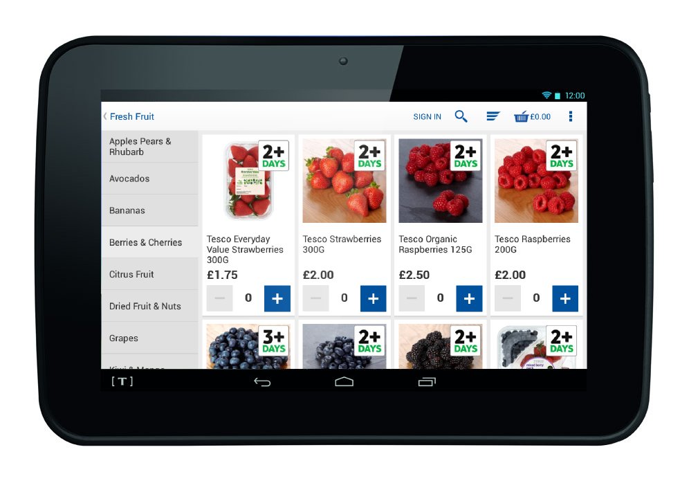
One of the first issues we had to tackle was the entry point for the audience. Should we go with a products-first-approach to highlight Tesco’s extensive product range, or rather with a user-centered dashboard? We decided on the latter: a classic dashboard, since ultimately the app offered multiple approaches to the shopping experience, and we wanted every user to get the right piece of information and access at the right time.
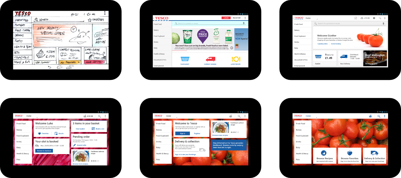
To make things a little more interesting, we experimented with big background images of vegetables or fruits. While definitely beautiful, we felt that they didn’t add enough value to the experience. After all, looking at perfectly lit shots of tasty groceries makes you hungry. We wanted to go further.
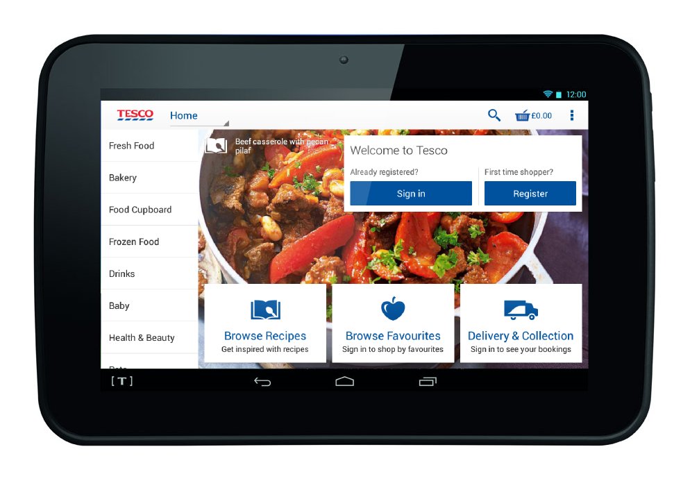
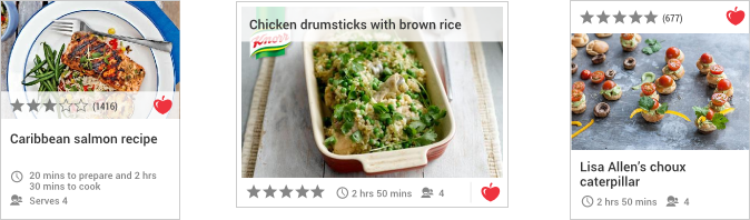
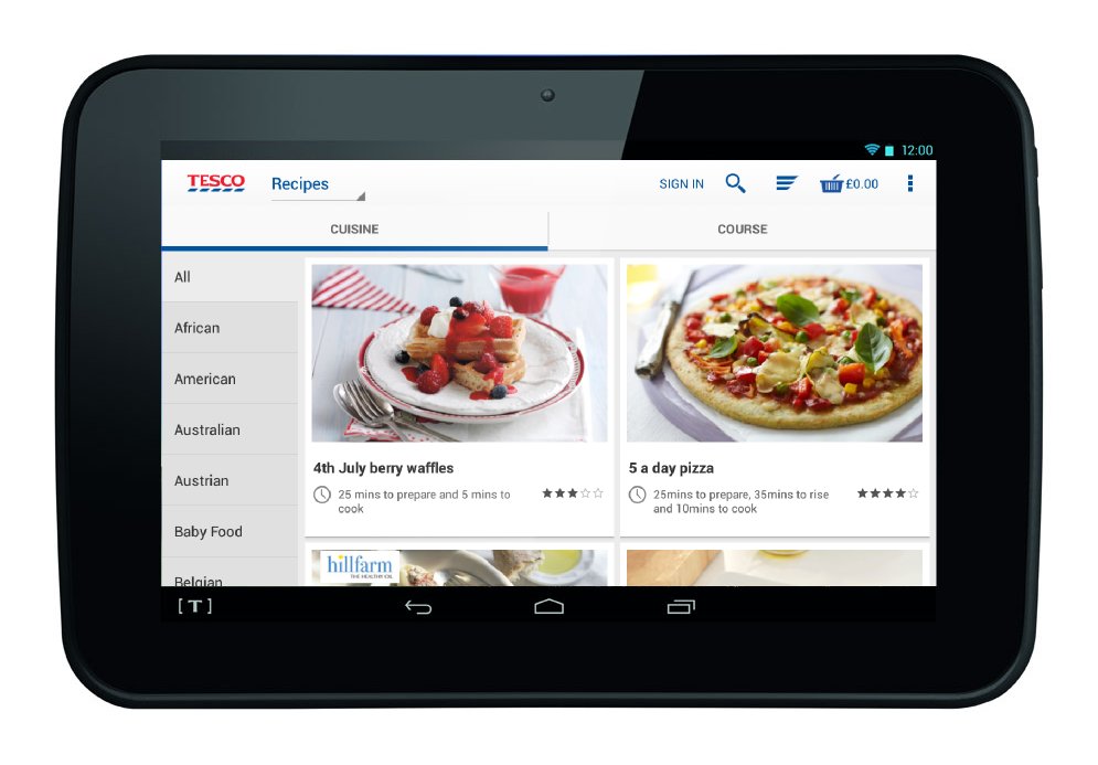
So we had groceries. Groceries are used for cooking. Most people follow recipes for cooking. We had recipes as well. That was the solution. Finally, we displayed photos of nicely prepared meals on the dashboard’s background. Not only were those beautiful as well, but they added inspiration: now, if I needed an idea for what to cook tonight, I could have a look at the recipe and from there order the needed groceries, perfectly rounding out the shopping experience.
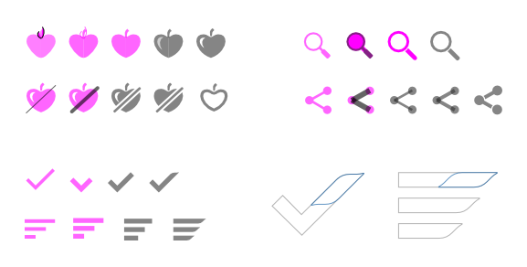
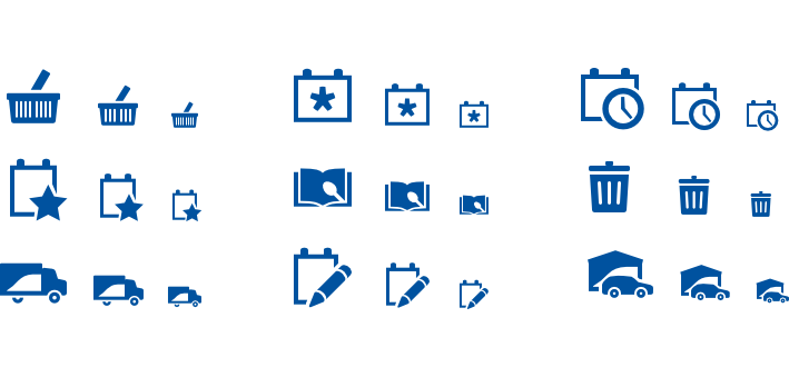
Icondesign
An experience depends largely on how it speaks to us through its design. We wanted to respect Tesco’s brand while staying true to the design language users know and love about Android. Luckily, the style guide employed since Android 4.0 is flexible enough to bend it a little without quickly feeling out of place. We took two of Tesco’s principles—“simple” and “human”—and redesigned a new set, combining both in the process.
Tesco’s iconic branding element, the chevron, makes an appearance here and there as well.
Working as a team
The timeframe of the whole development cycle for Hudl was ambitious. This was a new market for Tesco and they didn’t have an experienced internal team to build upon. Many people came and went in the course of six months, and everybody left a small hole that had to be filled quickly. Eventually, a common groove was established.
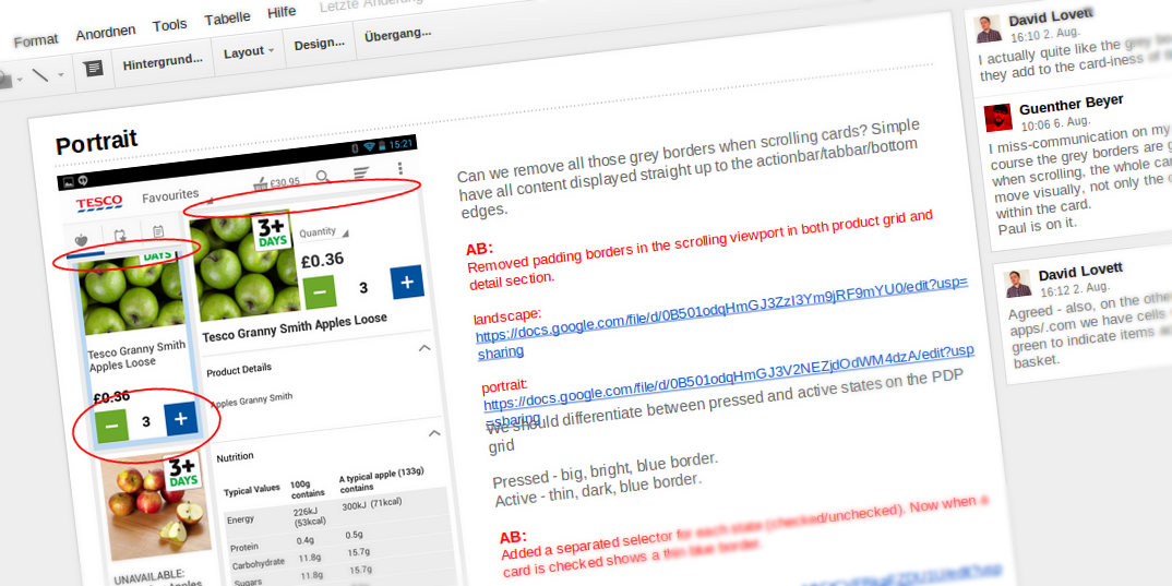
Opoloo’s experience in both design and development proved to be a valuable asset. We could quickly switch offices according to needs, bouncing off ideas and feedback with the Novoda team. After defining and tying together the lion’s share of screens and functions, we provided weekly reviews by pointing out unbalanced layouts, unclear copy, or rough patterns across the whole app. This helped keeping the quality of the project on a very high level.
Eventually, we gathered in London, three weeks before the official announcement for our first hands-on. The black prototype of the Hudl tablet felt solid, the screen was bright and clear. And with just a couple days distance from actually being involved in the development, we could finally get a clear picture of what we helped build over the last months: a great digital shopping & entertainment experience on a fine piece of hardware, that would be used by hundreds of thousands of people in the months to come.
“Android design is super hard to source. Opoloo are one of a handful of companies worldwide who have evolved their design consciousness at the same pace as the Android Design guidelines. Working with Opoloo is like working with the benefit of those many years.”
—Kevin McDonagh, CEO Novoda